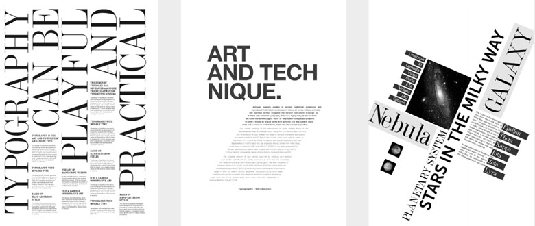
“When your art is aligned to alignments, results are profound.”
– Just an Art Director
Good design is within everyone’s reach. Even though you may never have attended an art class, you
can still create layouts that are compelling and easy to read. It can be just plain text on your page,
images mixed within the text, videos, buttons and call-to-actions, links or any other elements you
might need. Alignments can make or break a reaction.
Bad alignments are an itch unattended to by the art director. They are orgasmic enough to ruin your
entire communication, only not as enjoyable for the viewer.
Good alignments are like foreplay. They build a sense of comfort and woo the viewer to be
interested in whatever you have to offer.
‘Because, Alignment works at a subliminal level and makes your design click with the audience in a
certain way?’
How do Alignments makes your Design Work
Alignment allows the audience and readers a demarcated edge for their eyes to follow when
scanning or reading a piece. The clearer and concise the alignment, the stronger, cleaner, and more
pleasing your layout will be.
Text / Image / Icons
The alignment options for your text are similar to the options available in “CSS”. They are left, right,
centred or justified. Simply put, if you left-align your text then your attention will drift to the left, if
you right-align your text it will gravitate to the right. And this helps you to pull the viewer’s attention
to wherever you want it to be.
Alignments are always contextual – image with text, text with fotextnt or image with image.
For large blocks of text, use left alignment because it’s the easiest to read like newspapers, books,
and magazines. Right alignment is used on smaller chunks of text. Centred alignment is formal and
elegant, hence reserve it for graduation announcements and wedding invitations.
All our life we use alignments eg. In school line we were queued up according to our height so that
the person at the back was the tallest and hence, could see in the front over the shortest person in
the front of the line. Or on seesaw the heavy person would sit on one side and two skinny ones
would balance him on the other side. Just like this… with some common sense and an art director’s
gut ‘feel’ we should balance/align our layouts.
And once you are proficient with your rules, we will learn how to break them… in our latter blog.

In conclusion an Alignment comes hand-in-hand when working with grid systems. The subject of
alignment isn’t simply a matter of choosing whether or not you want to align text or images to the
left or right of a design instead, we employ alignment to improve our designs. Proper alignment in
your designs will make them visually more appealing and will also make it easier for users to scan
over a page, sub-consciously offering a calmer reading experience.

